Wednesday, 29 October 2014

String theory

To show us that negative space could be created very simply and with very little material, we were instructed to hang string around the room however we wanted.


After we'd made it extreamly hard to get around, we were to add tissue paper across the string just to make it a little more difficult. 


From this task i've learn that it really does take very little to create negative space. 

Friday, 24 October 2014

group project

From the long strips of paint and patterns we were to create a large group piece.
We started by putting some ideas together drawn from little parts of the original pieces. 


This was our final idea for the piece.


We developed our idea and our background took on a dream-like effect.


Our idea developed even further as we went on. We noticed that the piece actually looked better when it was portrait instead of horizontal.
As we tried to make sense of the piece, we saw that the bottom of the composition looked like a river with a stream of fire between it and the sky above it, so we chose to turn it into a fire forest next to a lake, in twilight.

I'm extremely proud of how our piece turned out. I think the colours work excellent together and it is clear what we were trying to achieve although we chose to go with an overall abstract feel.

Monday, 20 October 2014

Wait, that's not my face


The Cheshire cat

Through scrolling through endless YouTube makeup tutorial videos I saw one on how to transform your face to look like the Cheshire cat from Tim Burton's rendition of "Alice in Wonderland" and I couldn't resist giving it a go.
The first task was to cancel out my eye-brows and with thick dark ones like mine it wasn't easy. I applied glue over them after brushing them upwards first in an attempt to smooth them a little. I then applied powder and foundation over them. After repeating this 3 times I realized it was the best I was going to get for my first attempt and continued to follow the rest of the tutorial. I adapted the shape of the eye slightly to hide the parts of the eyebrows you could still see.

I made the outlines for the nose, eyes and smile then set to work on creating the fur which is harder than you think at first, but once I knew how the makeup I was using looked with the techniques I used I soon got it done. I didn't use the exact products that are used in the original video as I simply didn't have them but used products very similar. Highlights were created by just adding white face paint around and under the flicks of black. I'm extremely happy with how the fur came out but I would try a few different products first if I were to do it again as some were a little tricky to apply.

I made the cat pupils and then shaded around it adding light turquoise, dark blue, white and pale green to separate parts of the socket. 
After filling in the teeth, blacking the inside of the mouth out, sorting the lines around my nose and working on the fur a little more, I was done!


Original video tutorial:
https://www.youtube.com/watch?v=EAd0myherqg

Wednesday, 15 October 2014

Composition rules in art


I finally got round to doing my composition research for my canvas work and it surprised me how many there are.


Golden points and the Rule of thirds:

  • The best place to put the main subject of a painting is where the points intersect (in the red circles).


Example


The L shape:
  • It's unlikely to see the pure L shape in compositions 
  • Usually a mixture of several shapes in a composition when this is used.


The golden triangle:

  • The triangle is close to the center and the object is formed around the triangle shape.
  • Almost every Madonna and child format is based on the Golden triangle. 
                      Example


                                                                                                                 The golden spiral:

  • The golden spiral creates pleasing shapes within paintings because of the aesthetically pleasing proportions.
  • The paintings loosely follow the lines and curves of the spiral.

                                             Example


Pre-Raphaelites:

  • The Pre-rapaelites were a group of people who created their own rules of composition,
  • They insisted on giving an equal focus on all parts of their paintings,
  • They painted the backgrounds first and then the figures later,
  • Pre-Raphaelites began painting on white ground (rather than the prefered mid ground most artists would use),
  • Because of the way and structure they painted, everything becomes significant.


Example

Monday, 13 October 2014

The research begins, again

I might have recently just changed the course i'm wanting to do at university from fine art to Hair, makeup and prosthetics for performance. This decision came from talking about what I would actually get out of bed on a cold winters day and walk 6 miles to do. I have always had a passion for makeup but was always told to go down a more suitable path which was more likely to get me employed, but this is a passion and it's what i want to do.

So due to this i've had to almost start my research all over again.
And I can't wait.

Friday, 10 October 2014

paint and patterns

In our first weeks we were simply given five long strips of paper rolled across the floor and were told to fill is with whatever we wanted. we used paint, chalk and charcoal, oil pastel and whatever else we could find. this was the outcome:


We then used the images and patterns taken from the rolls to influence our work, which was firstly to make a college ID card stating our chosen pathway. It was also one of the first times i had used photoshop.


Thursday, 9 October 2014

The makings of a monster, Or giant killer rabbit

The making of Frankzilla 


On the first day of college we were told to make a form out of clay, and that was it. So after a few minutes of throwing a few ideas around the group we decided to make a giant mutant rabbit which was destroying a city.
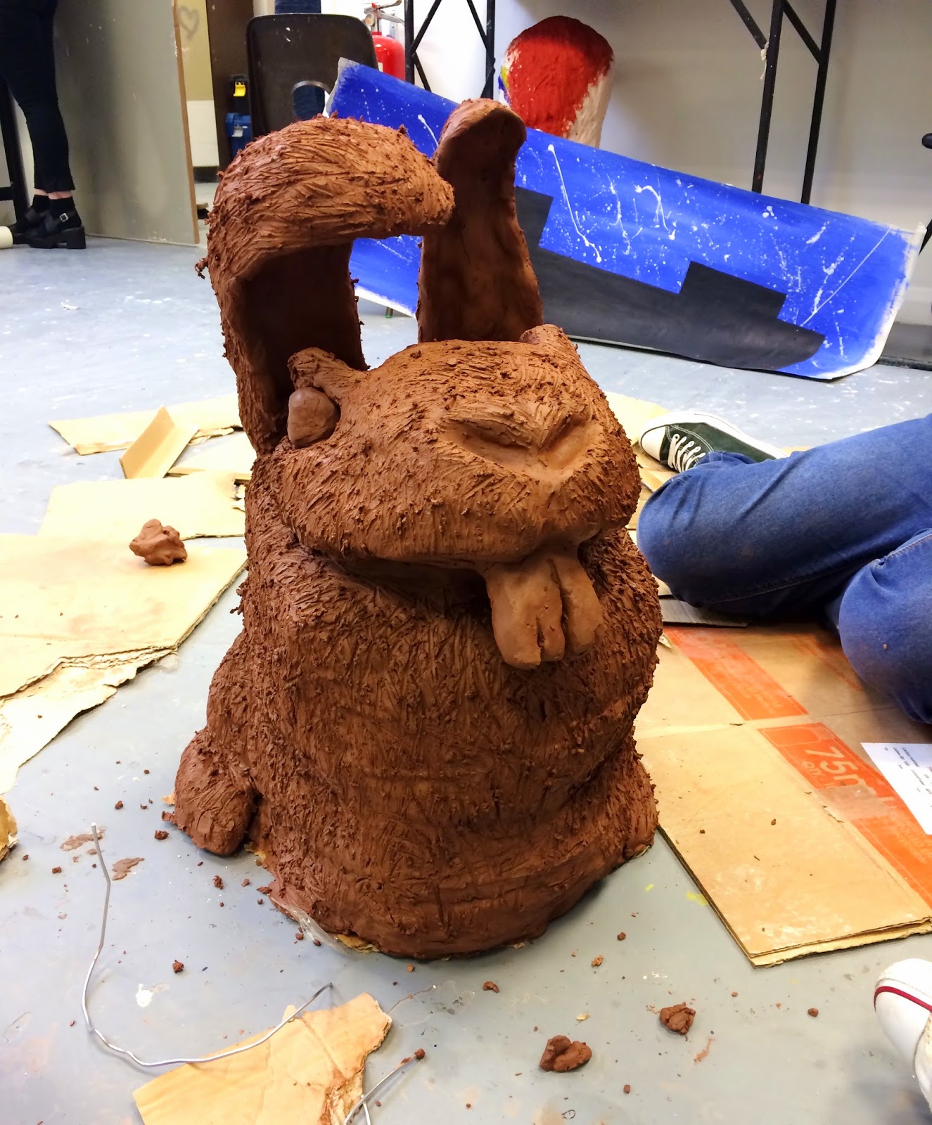
I got to work along with some of the others on the main body of the rabbit, which we named Frankzilla, while the other half of the group started to build the city which Frankzilla would be destroying. It was the first time id properly used clay to make anything so it took me a short wile to get used to the texture of the clay and how to mold it. We make the main body by placing a tall and slim cardboard box within it, stuffed newspaper around it so that it wasn't too heavy, and then molded clay around it to make the shape of the rabbits body.
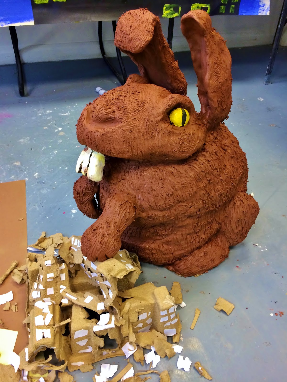


After constructing the body and head we added the ears which we had to hold up by sticking wires in the ends and through the box inside. We added mark-making by softly scraping the clay to give the effect of fur on the body. We then decided as a group to have it so Frankzilla had his paw on a destroyed building. to do this we had to place more wires through the box in the front. After this we painted the eyes to make the rabbit look more mutated with a cat-like pupil along with painting the teeth so they were clearly visible. Looking back i wish i made the teeth slightly smaller as they look too large for the face, but it is a mutant rabbit.
 We started placing the buildings around Frankzilla and slowly built the city up, even adding a skyline. However, we soon realized that it didn't look like much of a chaotic scene.
We added more blue tissue paper to resemble the water under the bridge, stones, red and yellow tissue paper in the buildings so they looked destroyed and more broken buildings. We also added dramatic lighting so that it looked more realistic and dramatized. In the end i'm really happy and proud with how the scene looked.


After creating the Frankzilla scene and took multiple photo's for it, we took those photos and created posters from them which resembled those of old movie posters such as the original Godzilla.

We created them by using Photoshop and adjusting the curves, lines, hue, saturation and multiple effects.
It's the first time i'd used Photoshop and naturally found it quite challenging, but after some time I gradually began to understand the software and liked the end effects.
For the font i placed the image into illustrator which i was more confused about than Photoshop. Clearly i'll have to work on my understanding of the program as it's the only part of the final product that i'm not happy with.


Tuesday, 7 October 2014

The Frank Bobbins Institute Exhibition.

PULL, AIM, SQUEEZE, SWEEP...


When walking into a, what looks like from the outside, to be a cold barn building in Worksop you don't expect to be met with an exhibition full of artwork. As mentioned, it was cold, very cold. And being as nesh as a person can be i felt felt it even beneath a woolly jumper. When beginning to actually look at the pieces you develop the foreign feeling of just being in your own little world with the art. I'm not denying i felt like id plummeted ten thousand miles out of my comfort zone when everyone around could distinguish the pieces within seconds where as it took me a little more time.


The first piece i really looked at and took in was this scene in the photos. it was a dressing table with multiple paints and make-up products layed out on top of it. On a small TV above the dresser a video tutorial of a male painting his face eccentrically with make-up. the thought was that the person sitting in the chair may replicate the tutorial, as a fellow student decided to do. I thought this piece represented how society "follows the crowd". in modern day becoming different and quirky is quickly becoming the norm and not different at all. it shows how people are willing to duplicate, in this case a certaqin look, because we saw someone else do it and are guided by them.


The second piece that caught my eye was this one, which i was later told was a representation of Miley Cyrus. To me the figure looks bored from the pose and what looks like the mouth being open and yawning. I like the representation of men's balls dangling from her hand as though they're q play you her her. I like the abstract form and line of this piece with the use of opaque and strong bold lines throughout creating definition. 

The second piece I looked at was a collection surrounded by the mundane subject of the household potato. 
I like this piece especially because of the complimentary tones.


This next collection did baffle and confuse me at first. The feeling i got was that the pieces were trying to show how we emphasis mundane things, in these works it is a potato which we would assume was pointless.                
                                           
I specifically liked this piece of artwork on the right because of the oposing colours making is attractive and the light hitting the hand really brings the piece alive. The thick black lines give definition to the form and gives it a cartoon look.

There was also more pieces in this collection aimed around potaoes and giving definition to the mundane object. All the pieces have an abstract feel to them with light sources coming from the left bringing the pieces together.


Performance art

Id never experienced  performance art before. This piece was by Rosie B and Named "After a while, they'll change your style..."
During the Performance the performer, dressed in white, takes handfulls of poppy seeds and slowly and methodically covers their face and body with them. next to the performance it explained "This piece is a meditation on the use of pain killers, antidepressants, sedatives, and other types oh psychotropic drugs. The poppy seeds signifies one of the first effective modern medicines to be synthesized by man - opium, or morphine as it is known today. At some point in all our lives, we will have to take a drug of some kind, but this piece questions where the line between abuse and dependence and legitimate drug use lies, and how drugs change or diminish our personalities."
I like how deep this piece of work got into this subject of drug use and really makes you think through its description.


I really enjoyed going through this exhibition because it was a new experience to go through different medias and the different aspects of art which I hadn't witnessed before. They made me think about my own work and will think of this exhibition when doing my own work.