Showing posts with label pathways. Show all posts

Thursday, 23 April 2015

Alternative miss world-the finished project I forgot to post


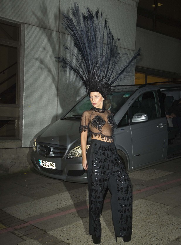
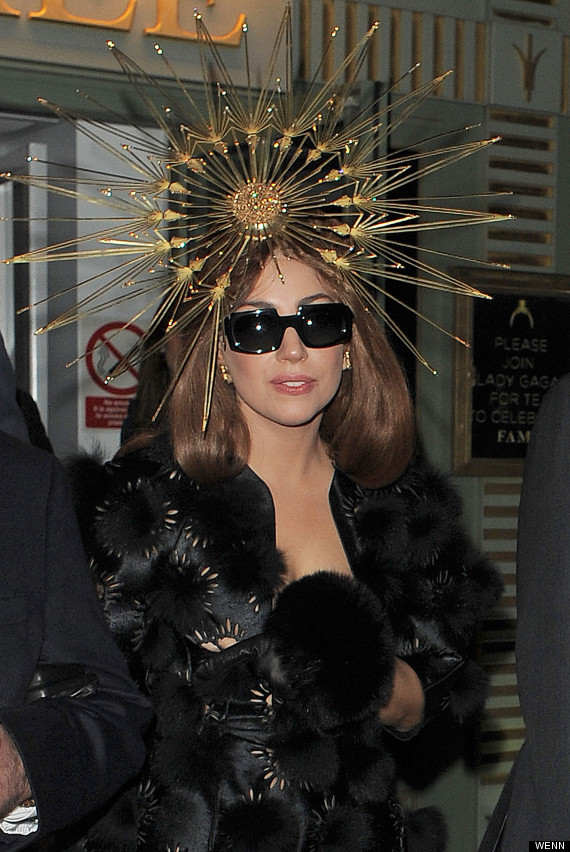
So after looking at carnival head dress i started looking at other headdresses. I gained inspiration from figures such as Lady Gaga who was famous for her out-landish wardrobe. I found that the designers used similar materials to what i had previously worked with like feathers. 


I wanted to make something quite geometric as i had an idea to do something with a cardboard box (at this point i didn't know what) to wear for sew hat so i needed it to complement that. i came up with a a simple design of squares around a headband but i knew it wasn't going to be quite so simple to actually make. 

My original plan to make the headdress was to make the base out of wire then to wrap cotton thread around the wire. The wire base was relatively easy to construct, minus the scratches. however, wrapping the cotton around the wire turned out to be quite a lot harder and time-consuming than i'd first antisipated so i needed to come up with a new idea to get the colour on the frame.
My first alternative was to wrap the wire in masking tape then colour it. it started out well but when i eft it for the night and came back to it in the morning it had started unravelling. so it was back to the drawing board.
After the light disaster I decided that i'd find some art straws, cut them to size, colour them with the desired colour then cut them up the centre so they were unwrapped. I then wrapped them around the frame and glue gunned them on the back so they were securely attached. this thankfully worked and was quite secure.


After looking at some of Lucy Mcrae's work i got an idea to see how paint could be dripped off an object for later use in a costume. i started with two maniquin heads to experiment with. i added PVA glue to acrylic paint in hope that it would thicken the paint and stick easier. At first, it looked promising...


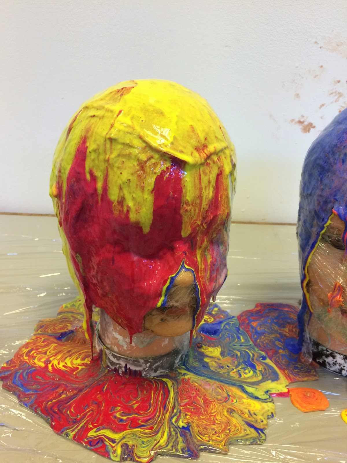


then a little, tiny disaster happened. the paint was not thicker, it almost slid right off and didn't cover the heads as solidly as i wanted. it was far too opaque to what i envisioned. 


 if i wanted to make a consume with this 'technique' i needed to think of a way to really thicken the paint.

And then i did. 
Thickener. this was the answer and it was in its own name.

I got my cardboard box, painted it white, cut it to shape and started dripping paint off of it. This time i mixed acrylic paint with a little PVA glue and a bit of thickener. 

yes it still dripped off of it but this is the style of drip that id wanted and designed for my box. 
But when it dried i felt it was a just a little bit boring so i added my favourite thing to jazz something up: GLITTER.


The glitter really did make it look ten times better and i was extremely pleased with it.
my original idea was to make this into a dress to wear from the neck down. But i accidentally made the hole too big so that it fell down my shoulders. For it to hang off my hips as a skirt i needed to make some simple braces. this was relatively easy to do with the box being quite stable. 

The finished outfit ready for sewhat:


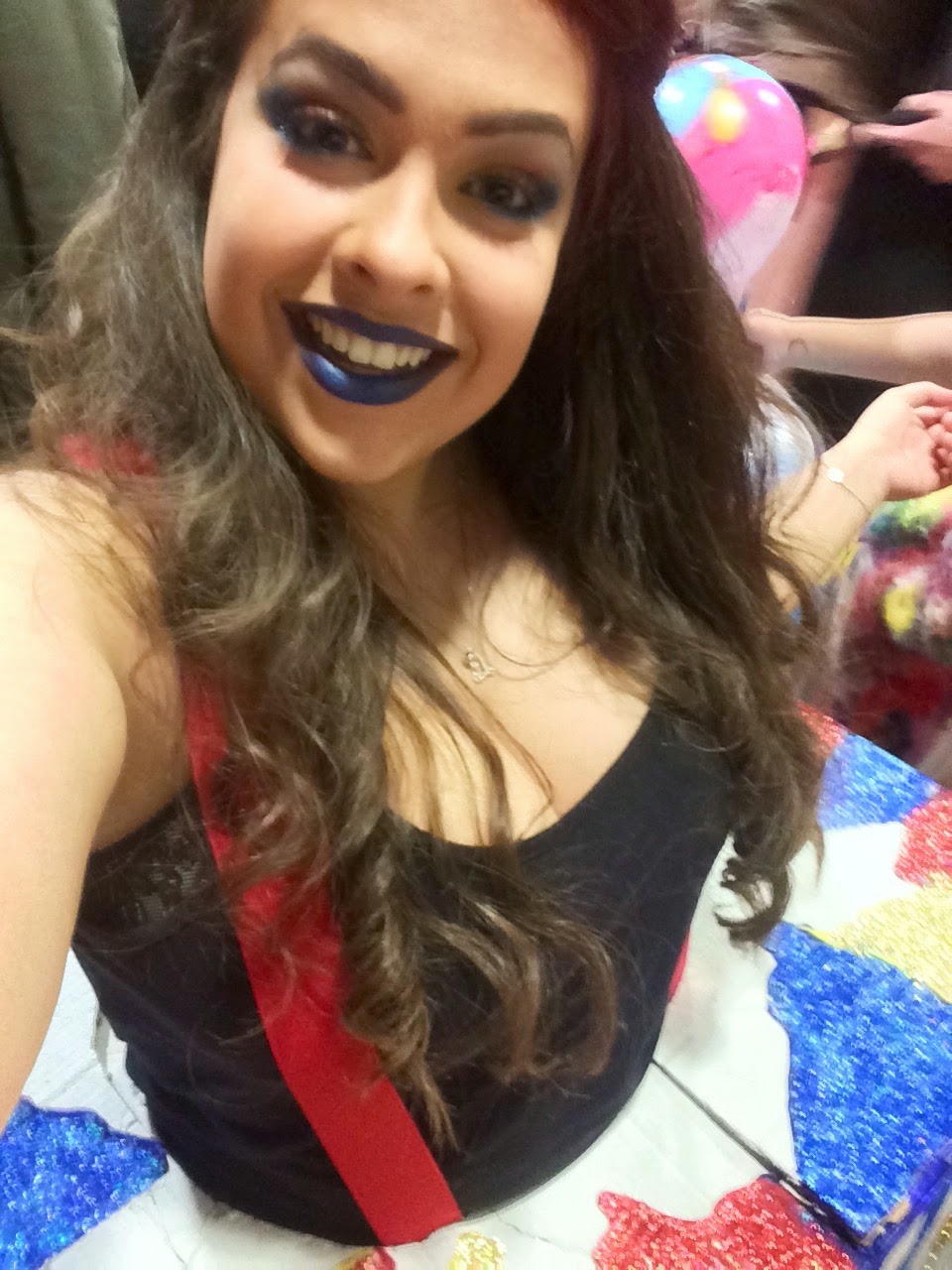
Sewhat selfies:


Monday, 30 March 2015

Richard Hamilton and his influences on my work

Looking at the sixties this piece by Richard Hamilton "just what is it that makes today's homes so different, so appealing" was known as the birth of Pop Art.
The piece is meant to represent a semi-ironic look at the mass market lifestyle which was adopted by America after the second world war.

In the style of Hamilton we made automatic collages.
Mine started out very automatic, with sticking pieces everywhere. Then I cut out from a magazine so the page looked like a sunbeam but placed it over previously stuck images. I really liked this effect and it became semi-automatic. I cut out this kind of deign a few other times in the collage and will be using it in further collages. I started cutting images up in similar ways but with subtle differences.


Sunday, 29 March 2015

Flowers to represent the characters of Parade


The Chinese conjuror- Plum blossom
the plum blossom is the national flower for the republic of Chine. It is a symbol of resilience and perseverance in the face of adversity, because the plum blossoms often bloom most vibrantly even amidst the harsh winter snow.


The little American girl: A rose
The rose is the state flower of New York.


The managers and the acrobats: Iris
The iris is the national flower for France. I chose an iris to represent both the managers and the acrobats as it is not specified as to where they are from and since the ballet was first preformed in Paris I thought it suitable to assume they originated in France.


Friday, 27 March 2015

The not-so-Swinging-Sixties

I didn't realise before my research just how drab the 60's were. We're told that the singing sixties was the best generation for music, young people, culture and architecture. The reality was anywhere outside a small triangle of London was not "swinging" but just the same as the 50's, the majority of people actually listened to some pretty bad music and the architecture of the time was depressing and the landscape looked grey with tower blocks on the horizon.


Pop art came through from abstract expressionism and was focused on popular culture. It was a joke to artists such as Andy Warhol who played on the consumerism surrounding America at the time. despite this I still really like the bold and colourful style of artists such as Roy Liechtenstein. I've looked previously at Peter Blake in earlier projects because of his collage style of work and still like it after looked further into it.

Thursday, 26 March 2015

Developing styles and flowers

Developing from my automatic drawings on friday i decided on making flowers out of some different materials.
coloured paper, tissue paper and sharpie


Sharpies.


acrylic paint applied with fingers and hands with a tissue paper centre. 

26/03/2015 Targets


  • develop more designs/ideas for fire curtain of 'Parade'
  • research into how flowers can represent the characters of the ballet
  • re-look at the ballet to describe each character
  • read back the synopsis to understand where i'm going with the project and to help previous target
  • look for into what the original fire curtain for the show was and what it represents


consolidate research from performance fire curtains into own designs for 'parade'

Friday, 20 March 2015

Automatic painting-Pollck style

research into abstract expresionism called for some automatic painting. And since flowers were coming out in my work i decided it would be fun to do some flower designs in Pollock's style


This was the first, more fitting style, that i did by splattering paint using various materials such as pain brushes and sticks.


I then channeled some insparation from Kline with his large dark and bold lines. I injected some colour though as i didn't like the plainness of his originals.

I'm not sure how to explain where this came from, it was purely experimental and automatic. i used a pallet knife to spatter the paint on the page and the colours i used reminds me almost of a sunset. the movements are full of expression and are the bold movements seen in the artists work i had previously looked at.

I finally got round to creating some flower paintings by dripping paint on to the paper below me from a paintbrush. i added the darker blue to contrast with the blue paper and to also hint at what the colour the petals would be were it to be a real flower or painted from observation.

I liked the final outcome of this automatic drawing with the deep purple tones adding the suggestion of the light.

Thursday, 19 March 2015

Abstract Expressionism


Abstract expressionism is a post–World War II art movement in American painting, developed in New York in the 1940s. It was the first specifically American movement to achieve international influence and put New York City at the center of the western art world, a role formerly filled by Paris.


Artists included:

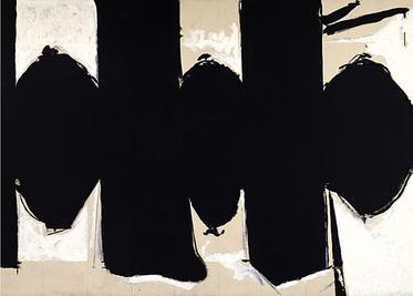
Robert Motherwell


I quite like Motherwell's work for the bold shapes he uses in his work matched with hints of colour.

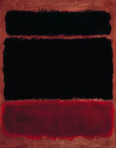
Mark Rothko

I'm really not a fan of Mark Rothko. Mainly for the reason his work is the opposite of what i aim for with mine. He wishes to pull a feeling of uncomfortableness from the people who witness his work through colour and scale where as i wish for them to feel happy. 


Franz Kline


Although i would inject some colour into this work i do like the bold brush strokes. Each line draggs your eye to look at a new part of the painting which is characteristic of abstract expressionism.


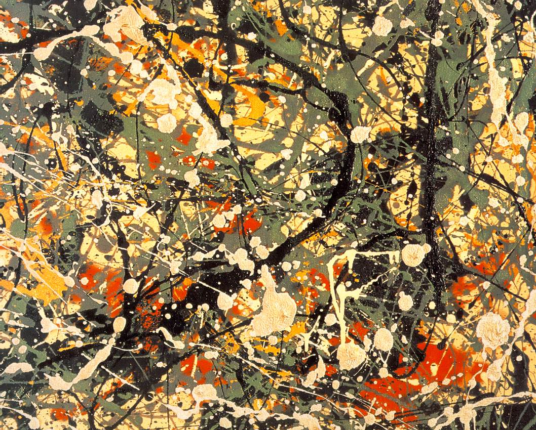
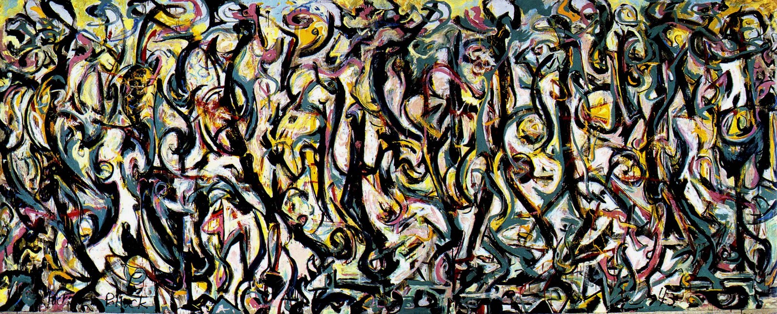
Jackson Pollock


I'm undecided about whether i like Pollock's work. I like the incorporation of colour in his work and the expression within it, however some of the pieces for me look unskilled although time and effort have gone into them.


Arshile Gorky


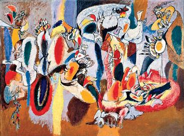
I really like Gorky's use of colour and shapes within his work. it reminds me of my own original automatic drawings. 


Willem De Kooning


The shapes and lines in De Kooning's work are unclear and more subtle to what i prefer however i do like the bold primary colours


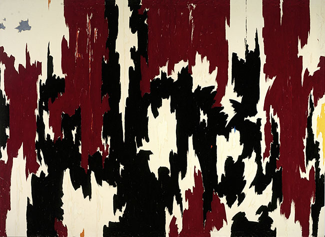
Clyfford Still


I really like Still's work. The vibrancy and abstract form of the colours and composition attract me. His work can be taken as many objects with people suggesting they look like flowers and butterflies. I think they have an element of freedom within them which is mainly why i like them so much.