Thursday 30 April 2015

todays targets

targets for today:

  • Finish photoshopping flower collages,
  • cut images to work as a new flower,
  • sketch using biro and pencil or new flowers.
Have they been achieved?
My first two targets have been met and I'm happy with the outcome (will soon be posted on my blog). but because creating the new flowers took longer than i had imagined i haven't been able to do all my sketches. these will be finished tomorrow as they're set be finished this week on my time plan.

Creating new flowers

using photoshop was a lot easier than genetic manipulation. 


Name: Minime
Connotations: motherhood, recreation, new life


Name: Pinkabelle
Connotations: fulfilment, openness, freedom


Name: Colour Wheel
Connotations: young spirit, boldness, creatness, freedom

Wednesday 29 April 2015

A mix of artists

From doing some work with daisies and Alex Katz i decided i wanted my large-scale painting to look simular to one of his flower scenes. 

Alex Katz

But I also wanted a bolder pop-art influence so i chose to mix the style with Roy Lichtenstein's.

Roy Liechtenstein

The composition is very similar to that of Katz but the flowers i made more pointed. this was done so that the flower did not look as "innocent" as is usually described. the black bold outline taken from Lichtenstein also adds to taking this connotation away while maintaining the prettiness of the flower.

Roy Liechtenstein's black line added to some original photos


Collages

After looking at Richard Hamilton's "what makes todays homes so different, so appealing?" and doing my own automatic collages i decided i really liked doing them. i made a few little ones to start off my project, but i really wanted to do some with photoshop, after looking at Jeff Koons' collages that look much more automatic, with the images i got from the Sheffield Botanical Gardens.

My first was quite automatic in the i placed the flowers very randomly and changed the colours just to see how they would look when mixed with others

my second was purely experimental to see and remind myself of how overlaying an image with another could be seen to be sprouting through.

after making the saturation of the flower higher a friend said how it looked like coral. this gave an idea to place one of my images of the tree behind it, suggesting the sea, and cover the bottom to look like coral covering the sea floor.

I'd cut my paper collages to look like a sunbeam so i gave it a go using photoshop. it makes the image more interesting and i added block colouring as an inspiration from pop art.

I experimented here with making the sunbeam pattern using colours instead of cutting out the image. again reminding me of pop art with bright colours.

I wanted to create a new flower so i combined two. 

this collage was experimental as i wanted to see how the flower looked when the hue was changed.

i experimented more with hue and actually really like these last two images because they look more refined than the others and like a colour swatch.


Friday 24 April 2015

The daisy

The daisy has been seen to represent cleanliness, youth, purity and fertility.

It has been used in the christian world as a symbol of Virgin Mary to signify her chastity, grace and purity. and still represents such things today.

Because of the symbolism attached to this flower i decided i wanted to do a large scale painting including it, but i first wanted to decide on the composition and style in which to do so.

I wanted to adopt Wayne Thiebaud's stratagy of painting which is to use a lot of paint to see how to create my daisy.


Wayne Thiebaud


I used my hands to paint instead of brushes, because it brings a certain energy to a painting which i can't get when using a brush. On half on the painting i blended the paint, and on the other half i 'dotted' the paint more to see the different view both would give. i prefer the dotted side because the contrast draws you to the image and gives it texture.

Alex Katz

After looking at Thiebaud i looked at Alex Katz and his simplistic way of painting. i immediately liked it and wanted it to influence my painting.

I did a quick pencil colour sketch with his influence which i quite liked. it almost stops looking like a daisy because of the harshness of the lines on the tips of the petals.


Both the painting and the drawing has helped in designing a composition for my large scale painting but i still need to decide whether I'm going to change the design of the daisy.

Thursday 23 April 2015

Alternative miss world-the finished project I forgot to post


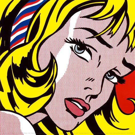
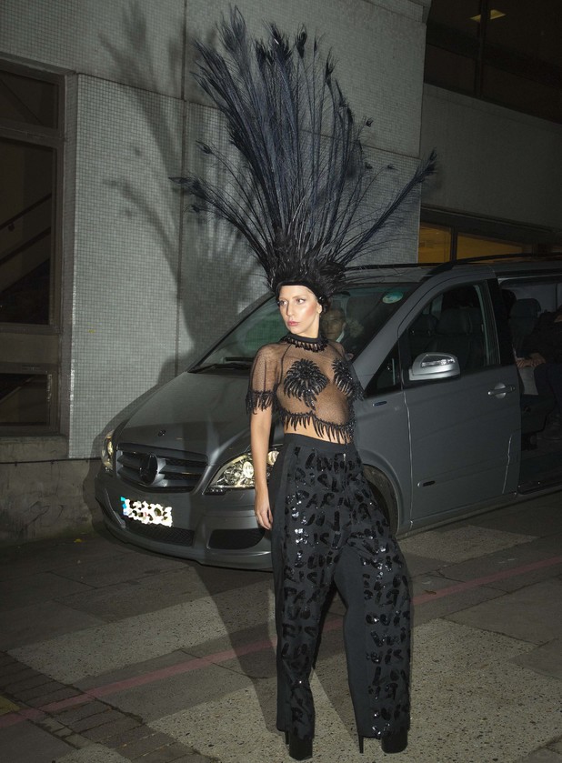
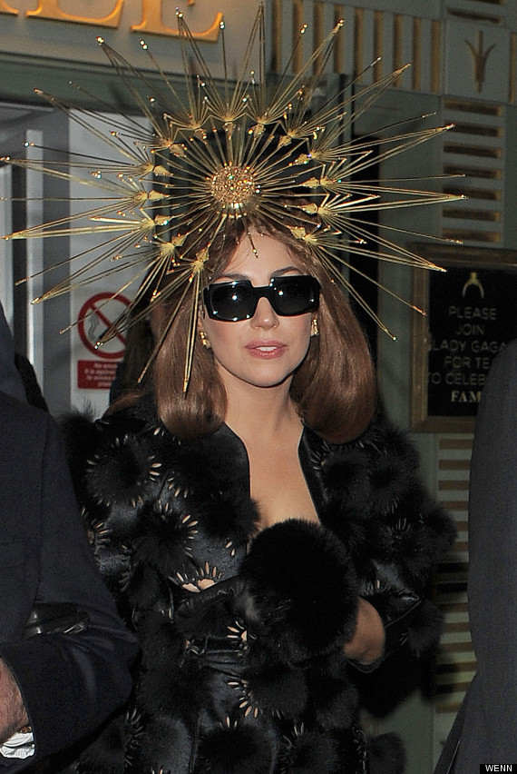
So after looking at carnival head dress i started looking at other headdresses. I gained inspiration from figures such as Lady Gaga who was famous for her out-landish wardrobe. I found that the designers used similar materials to what i had previously worked with like feathers. 


I wanted to make something quite geometric as i had an idea to do something with a cardboard box (at this point i didn't know what) to wear for sew hat so i needed it to complement that. i came up with a a simple design of squares around a headband but i knew it wasn't going to be quite so simple to actually make. 

My original plan to make the headdress was to make the base out of wire then to wrap cotton thread around the wire. The wire base was relatively easy to construct, minus the scratches. however, wrapping the cotton around the wire turned out to be quite a lot harder and time-consuming than i'd first antisipated so i needed to come up with a new idea to get the colour on the frame.
My first alternative was to wrap the wire in masking tape then colour it. it started out well but when i eft it for the night and came back to it in the morning it had started unravelling. so it was back to the drawing board.
After the light disaster I decided that i'd find some art straws, cut them to size, colour them with the desired colour then cut them up the centre so they were unwrapped. I then wrapped them around the frame and glue gunned them on the back so they were securely attached. this thankfully worked and was quite secure.


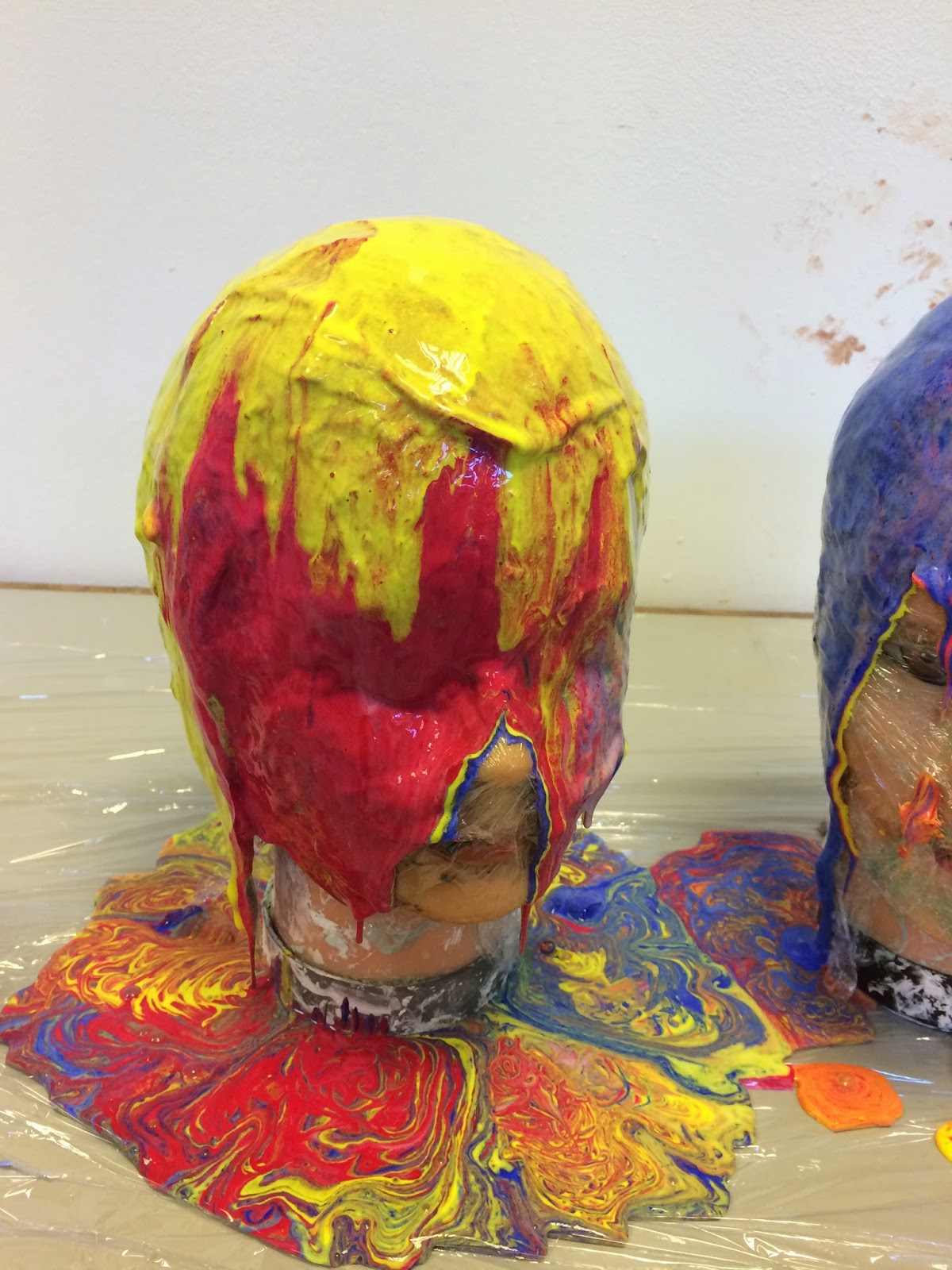
After looking at some of Lucy Mcrae's work i got an idea to see how paint could be dripped off an object for later use in a costume. i started with two maniquin heads to experiment with. i added PVA glue to acrylic paint in hope that it would thicken the paint and stick easier. At first, it looked promising...


then a little, tiny disaster happened. the paint was not thicker, it almost slid right off and didn't cover the heads as solidly as i wanted. it was far too opaque to what i envisioned. 


 if i wanted to make a consume with this 'technique' i needed to think of a way to really thicken the paint.

And then i did. 
Thickener. this was the answer and it was in its own name.

I got my cardboard box, painted it white, cut it to shape and started dripping paint off of it. This time i mixed acrylic paint with a little PVA glue and a bit of thickener. 

yes it still dripped off of it but this is the style of drip that id wanted and designed for my box. 
But when it dried i felt it was a just a little bit boring so i added my favourite thing to jazz something up: GLITTER.


The glitter really did make it look ten times better and i was extremely pleased with it.
my original idea was to make this into a dress to wear from the neck down. But i accidentally made the hole too big so that it fell down my shoulders. For it to hang off my hips as a skirt i needed to make some simple braces. this was relatively easy to do with the box being quite stable. 

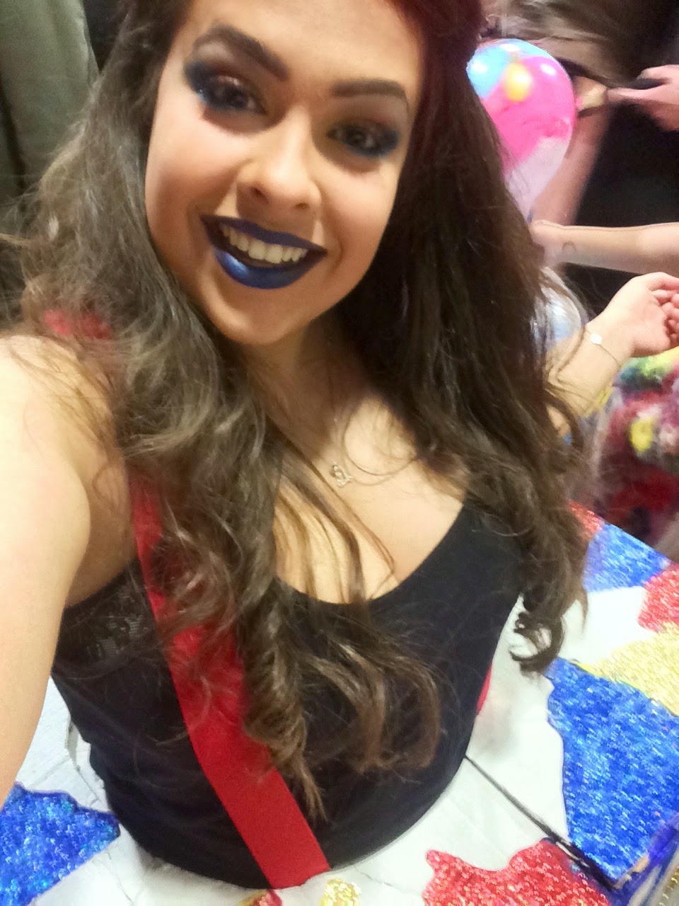
The finished outfit ready for sewhat:


Sewhat selfies: